# Libraries
library(ggplot2)
library(dplyr)

# Importing titanic
titanic <- read.csv("https://raw.githubusercontent.com/DataKortex/Data-Sets/refs/heads/main/titanic.csv")Data Visualization with ggplot2
Introduction
In this chapter, we introduce data visualizations in R using ggplot2, the most widely used package for graphical representation in R. This package is part of the tidyverse collection, making it highly compatible with tools like dplyr for data manipulation. To keep things simple and focused, we’ll use the titanic dataset for all examples. This dataset is available from several public sources, including GitHub and Kaggle.
The logic behind ggplot2 is modular: we begin with a basic plot and then add layers of various elements to specify additional components, such as points, lines, labels, or colors.
Just as we use the pipe operator (%>%) in dplyr to build data workflows step by step, ggplot2 follows a layered grammar of graphics. This approach allows us to define clearly and systematically what should appear in a plot, making our code flexible and readable.
Preparing the Environment
Let’s begin by loading the necessary R packages, dplyr and ggplot2, and importing the titanic dataset from GitHub:
The titanic dataset contains information on 891 passengers aboard the RMS Titanic. This version is a cleaned subset of the original passenger manifest and is commonly used for educational and modeling purposes.
Since we’ll analyze this dataset in the next chapter as well, here we will only briefly describe the three variables we’ll focus on:
Fare: The fare paid for the ticketAge: The age of the passenger in yearsSurvived: Indicates whether the passenger survived (1) or did not survive (0)
To simplify our plots, we will create a subset of the dataset that includes only these three variables, while transforming the variable Survived to a factor:
# Subsetting the dataset to keep only the three relevant columns
titanic_subset <- titanic %>%
  select(Fare, Age, Survived) %>%
  mutate(Survived = as.factor(Survived))
Starting from Scratch
The plot below shows the relationship between Age and Fare:
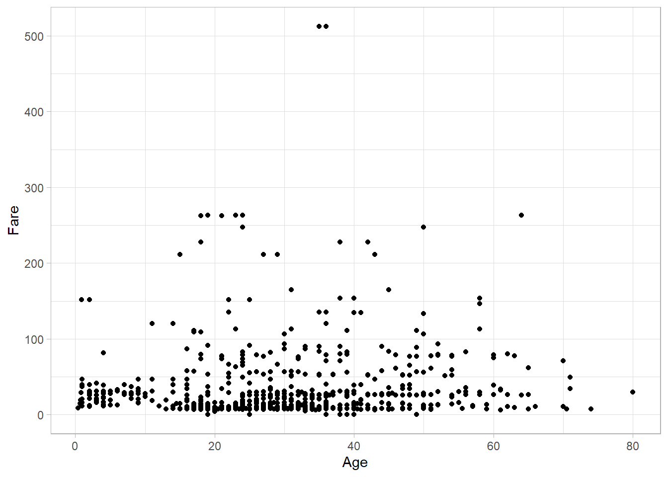
There is no strong association between these two variables—older passengers could have either cheaper or more expensive tickets compared to younger passengers. In statistical terms, there is no clear correlation between Age and Fare.
Let’s now walk through on how to re-create this plot from scratch using ggplot2.
Whenever we begin a new plot, we use the ggplot() function. The first argument we need to specify is the data we want to plot using the data argument. For example, to start a plot based on the titanic dataset:
ggplot(data = titanic_subset)
This generates an empty plot. Although it might seem like something is missing, this is actually expected; even though we have specified the dataset, we have not yet told R what we would like to plot (or how to plot it).
Next, we define the aesthetic mappings using the aes() function, which stands for aesthetics. In ggplot2, aesthetic mappings link variables in the dataset to visual properties like position (x, y), color, size, etc. To set Age on the x-axis and Fare on the y-axis, we use:
titanic_subset %>%
  ggplot(mapping = aes(x = Age, y = Fare))
Now the plot shows axes labeled with the correct variable names, but still no data points, because we still have not yet defined how to represent the data visually. To do that, we add a geometry, which tells ggplot2 how to display the data. For a scatter plot (where each point represents one observation), we use geom_point():
titanic_subset %>%
  ggplot(mapping = aes(x = Age, y = Fare)) +
  geom_point()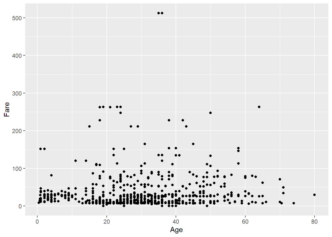
Notice that in ggplot2, we add layers to the plot using the plus sign (+), not the pipe (%>%) used in dplyr. The result is a functional scatter plot. To refine its appearance, we can customize the theme, which controls non-data elements like background color, grid lines, font sizes, and margins. ggplot2 offers several built-in themes. In our original example, we used theme_light():
titanic_subset %>%
  ggplot(mapping = aes(x = Age, y = Fare)) +
  geom_point() +
  theme_light()
The final plot looks exactly like the one we presented at the beginning of this section. This example demonstrates the modular nature of ggplot2: each layer builds on the previous one to produce the final visualization.
To summarize, every plot in ggplot2 consists of four main components: data, aesthetics, geometry, and theme. A fifth, optional component is facets, which allow us to split one plot into multiple subplots based on a variable. We will now explore each of these layers in more detail, including how facets work.
Data and Aesthetics
The first thing we need to consider before creating a plot is the data we want to visualize. For instance, the Age and Fare variables are numeric (continuous), so it makes sense to visualize them with a scatter plot. A bar plot, on the other hand, typically requires a categorical variable along with a continuous one—so we wouldn’t be able to create a meaningful bar plot using only Age and Fare, since the values of one variable would be treated as different categories.
At this stage, we are only choosing which data and variables we want to use. We haven’t yet specified whether we want a scatter plot or a bar plot, or even which variable should go on the x-axis. When we talk about data, we’re simply referring to the data frame that will be used for plotting. In earlier examples, when we created the blank canvas, that was the step where the data was specified.
Once the dataset is chosen, we decide on the aesthetics, meaning which variables will be mapped to visual elements of the plot. Aesthetics include everything we write inside the aes() function. In the previous example, we included Age and Fare in aes(). Although we didn’t see any shapes on the plot at that point, we could already see the x and y axes labeled, meaning those aesthetics have been mapped.
Besides the x and y axes, we can map more variables to additional aesthetics while still keeping the plot two-dimensional. For instance, we can add the Survived variable to color the points in the scatter plot:
titanic_subset %>%
  ggplot(aes(x = Age,
             y = Fare,
             color = Survived)) +
  geom_point() +
  theme_light()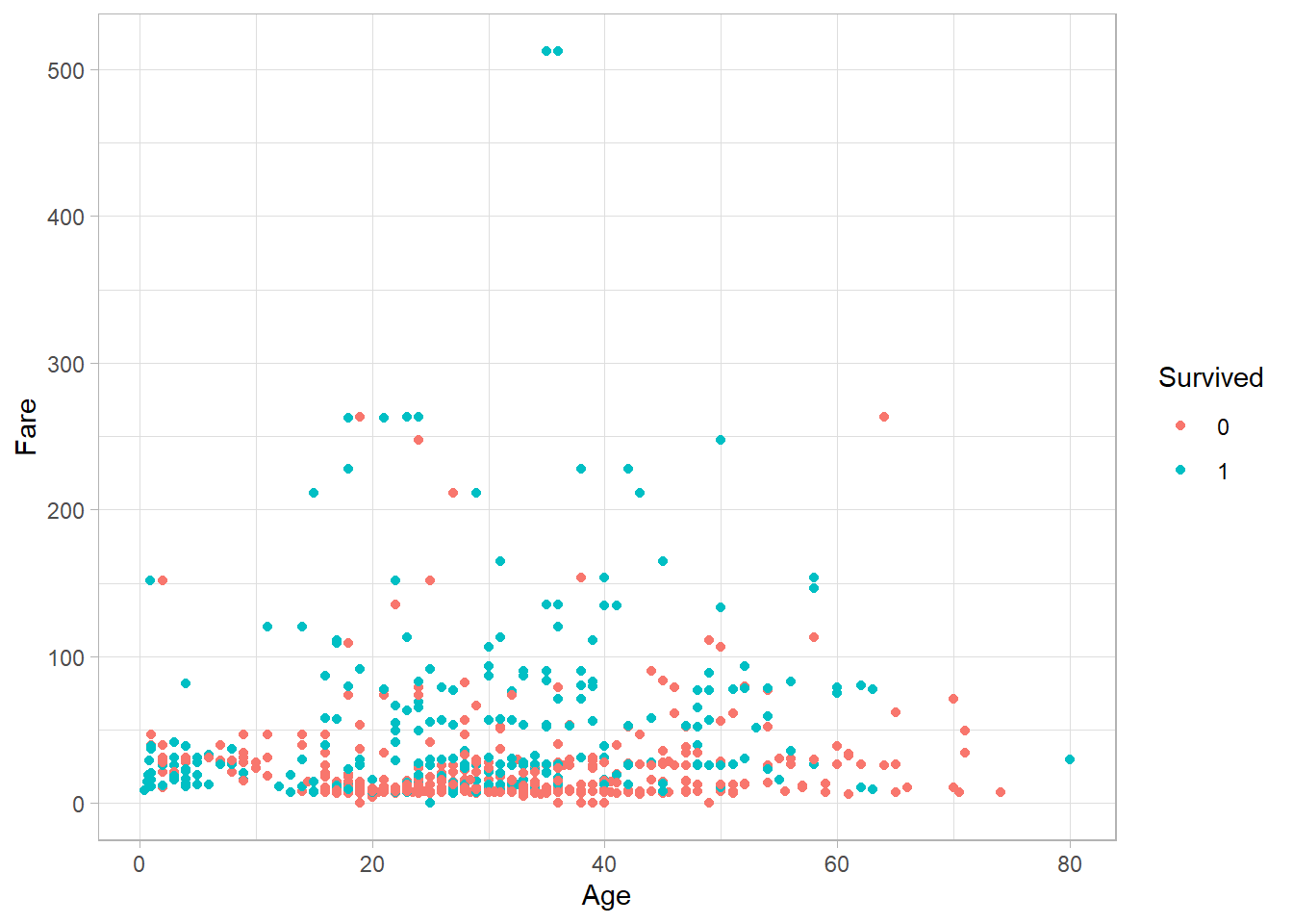
Each point now has a color based on the corresponding survival status. Similarly, we can map variables to other aesthetics:
fill: fills an area with color (used in bars, boxplots, etc.)shape: changes the shape of the pointalpha: adjusts transparencysize: adjusts the size of points or lines
Depending on the data type, these mappings may or may not make sense, so it’s worth experimenting with different combinations to explore their effects.
If instead we want to assign fixed values to these aesthetics (not based on a variable), we do this outside of the aes() function, inside the corresponding geom_*() layer. For example, here we set all points to blue, manually:
titanic_subset %>%
  ggplot(aes(x = Age,
             y = Fare)) +
  geom_point(color = "blue") +
theme_light() 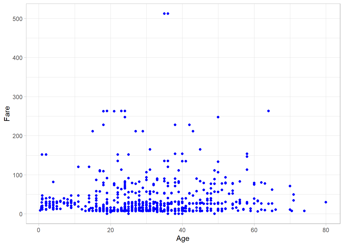
It might seem confusing at first, but the rule is simple:
If the aesthetic is mapped to a variable → put it inside
aes()If the aesthetic is set to a fixed value → put it outside
aes()
It is important to note that we can specify aesthetics either in the ggplot() function or inside the geom_point() function. When aesthetics are defined in ggplot(), they are inherited by all subsequent layers (geoms); we will see later in this chapter how to add multiple geoms. In contrast, when aesthetics are specified inside a specific geom_ function, they apply only to that particular layer.
There are additional aesthetics we can adjust to control the appearance of the plot. For example, we can limit the x-axis and y-axis ranges using the xlim() and ylim() functions respectively:
titanic_subset %>%
  ggplot(aes(x = Age,
             y = Fare,
             color = Survived)) +
  geom_point() +
  theme_light() +
  xlim(0, 120) +
  ylim(0, 600)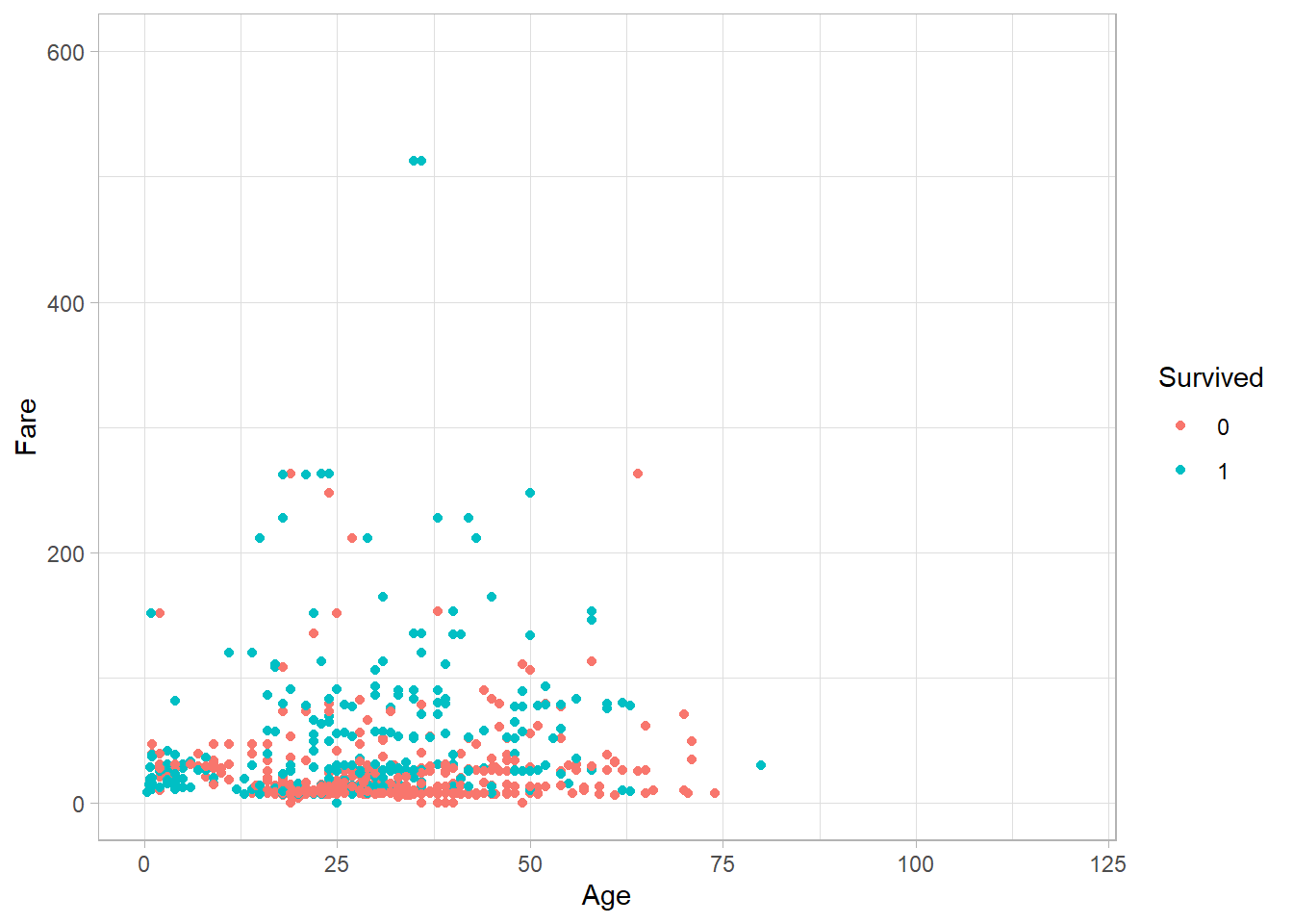
This sets the x-axis range from 0 to 120 and the y-axis range from 0 to 600. Any points outside these limits will be omitted, and R will issue a warning when the code is executed.
We can also change how values are scaled using functions that start with scale_*(). For example, to show the x-axis in log-10 scale:
titanic_subset %>%
  ggplot(aes(x = Age,
             y = Fare,
             color = Survived)) +
  geom_point() +
  theme_light() +
scale_y_log10() 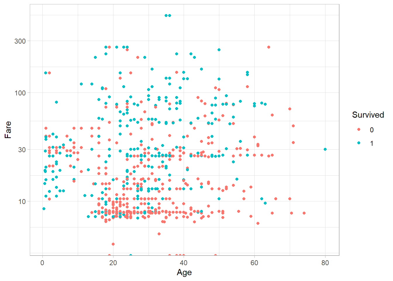
We often want to add titles and axis labels to make our plots easier to understand. This is done using the function labs():
titanic_subset %>%
  ggplot(aes(x = Age,
             y = Fare,
             color = factor(Survived))) +
  geom_point() +
  theme_light() +
  labs(
    x = "Passenger Age",
    y = "Ticket Fare",
    color = "Survived")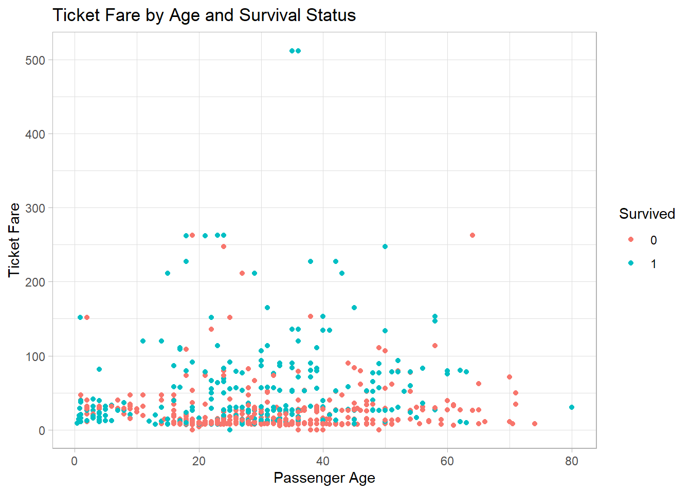
Here, labs() adds labels for the x-axis, y-axis, legend, and title. Although not technically part of the core aesthetics, labs() is conceptually linked to the aesthetic layer because it describes how aesthetics are communicated.
When a variable is mapped to an aesthetic, we can use the scale_*_manual() family of functions to manually control how values are displayed. Here’s how to change the colors assigned to survival status:
titanic_subset %>%
  ggplot(aes(x = Age,
             y = Fare,
             color = factor(Survived))) +
  geom_point() +
  theme_light() +
  scale_color_manual(values = c("0" = "red", "1" = "green")) +
  labs(color = "Survival Status")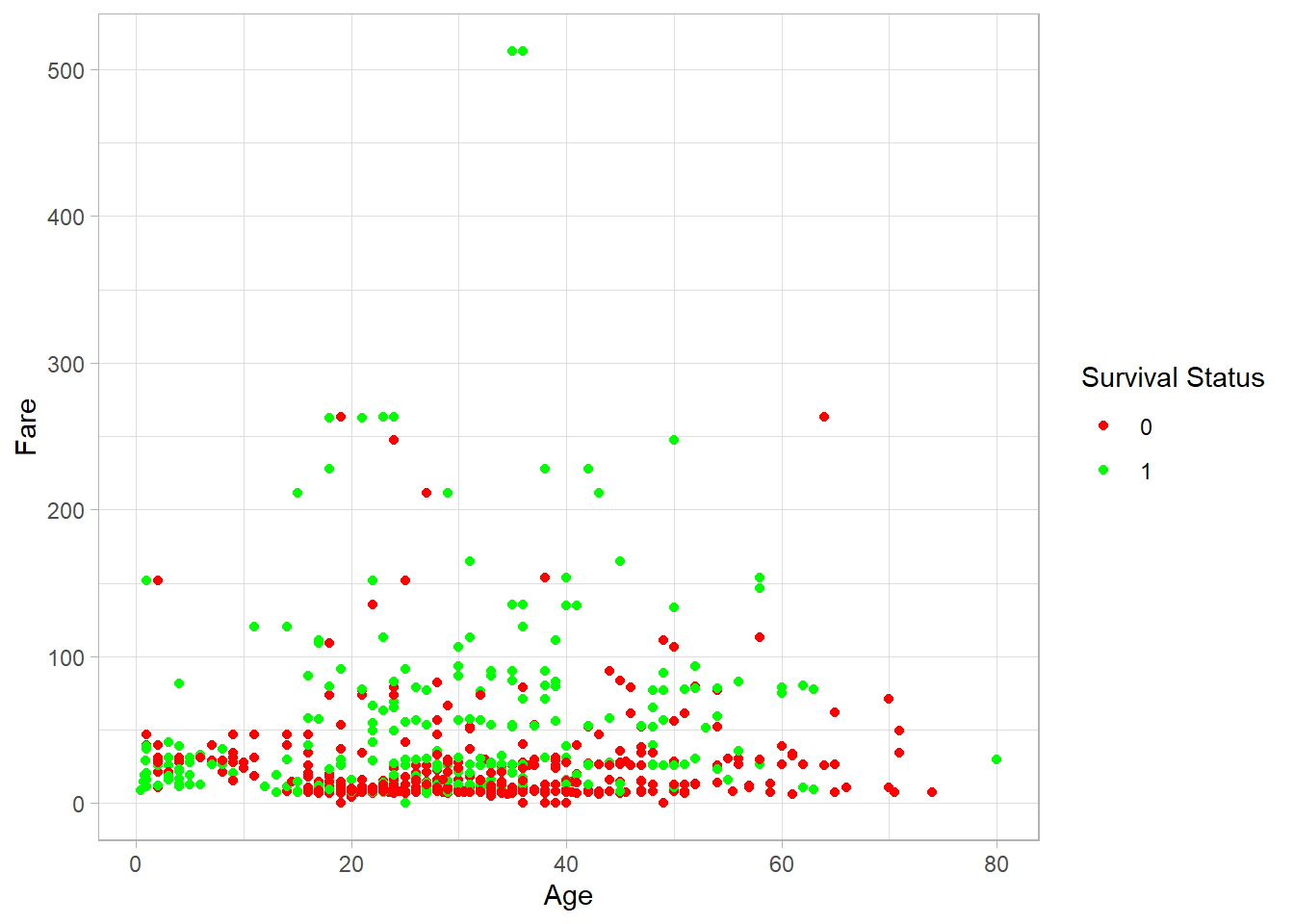
We can also manually set shapes, fill colors, transparency, and sizes using similar functions:
scale_fill_manual()scale_shape_manual()scale_alpha_manual()scale_size_manual()
For example, setting custom shapes:
titanic_subset %>%
  ggplot(aes(x = Age,
             y = Fare,
             shape = factor(Survived))) +
  geom_point() +
  theme_light() +
  scale_shape_manual(values = c("0" = 1, "1" = 16)) +
  labs(shape = "Survival Status")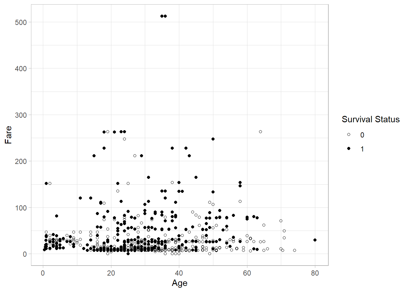
These tools give us full control over how your aesthetics appear in the plot, allowing you to adapt your graph for clarity, emphasis, or even publication styling.
There are still more aesthetics available beyond those mentioned above, depending on the type of plot and driving the visual effect one aims for. The full list of available aesthetics can be found on the ggplot2 official documentation site or by using the ?aes help command in RStudio.
Geometry
So far, we have specified the data and the aesthetics we want to use in a graph, but we have not yet specified what kind of plot we want to create. Should it be a scatter plot, a histogram, or a bar chart?
In ggplot2, we define the type of plot using a function that starts with geom_*(). For example, earlier we used geom_point() to create a scatter plot. We could have used geom_line() to create a line plot instead (although it might not yield any useful insights in our Titanic data!). The geometry function determines the form of our plot.
There are many types of geometries available in ggplot2. In this section, we will focus on some of the most common ones, namely:
Scatter plots
Histograms and density plots
Bar plots
Box plots
Line plots
Scatter Plots
We already created a scatter plot at the beginning of this chapter using the geom_point() function. A scatter plot is ideal when we want to display two numeric variables on the axes. We can add more variables to a scatter plot by changing an element of the plotted points. For example, we previously used the variable Survived to color the points - we could similarly change shape.
Histogram and Density Plots
In Chapter Statistical Distributions, we introduced histograms and density plots as tools to visualize the distribution of a variable. Now let’s see how to create them.
We use geom_histogram() and geom_density() to generate histogram and density plots respectively. These are one-dimensional plots, so we only need to specify the x variable inside the aes() function:
titanic_subset %>%
  ggplot(aes(x = Age)) +
  geom_histogram() +
theme_light() 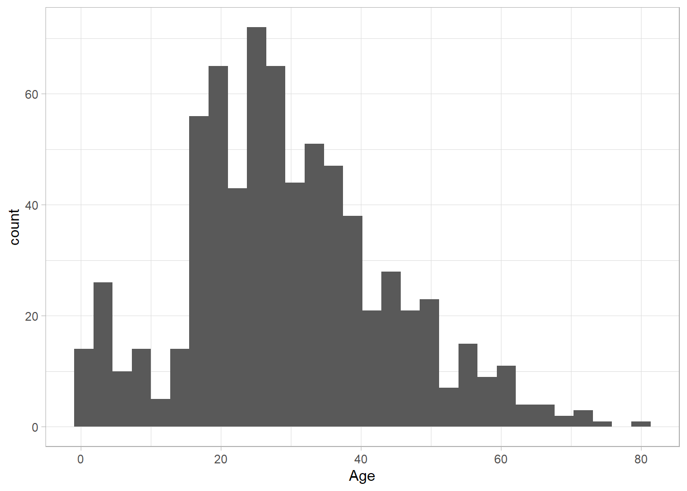
The distribution of Age looks roughly normal. We can change the granularity of the histogram by using the (number of) bins or binwidth arguments in geom_histogram(). We only need to set one of the two, as the other one will be set automatically:
titanic_subset %>%
  ggplot(aes(x = Age)) +
  geom_histogram(bins = 5) +
theme_light() 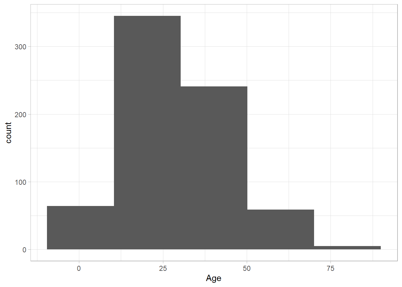
titanic_subset %>%
  ggplot(aes(x = Age)) +
  geom_histogram(binwidth = 10) +
theme_light() 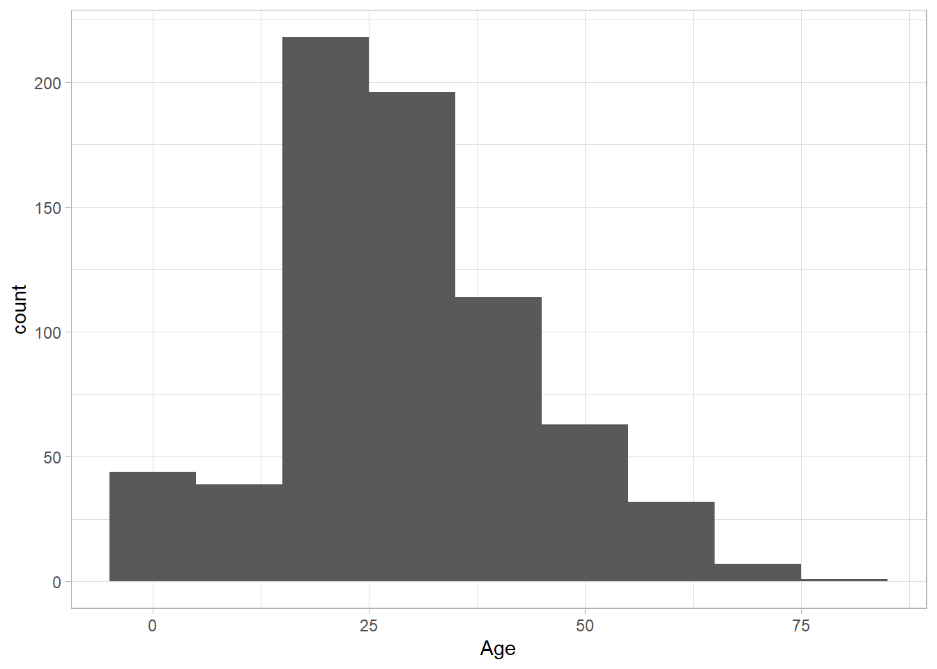
We can also explore the distribution of Fare, using a density plot:
titanic_subset %>%
  ggplot(aes(x = Fare)) +
  geom_density() +
theme_light() 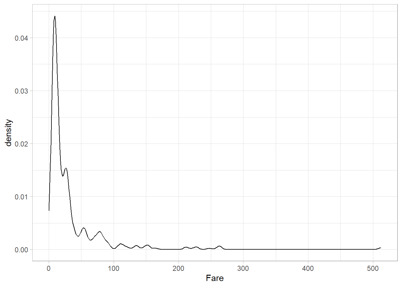
The variable Fare seems to follow a log-normal distribution, with a long right tail.
We can also combine these two types of geometries into one plot—but in that case, we need to manually specify the y-axis. A histogram shows counts on the y-axis, while a density plot shows densities. To combine them, we use both geom_histogram() and geom_density(), and set the y aesthetic inside aes() to the somewhat unusual expression ..density... This special notation tells ggplot2 to scale the histogram so that it represents a density rather than raw counts, allowing it to align correctly with the density curve. We also modify the appearance to make the plot clearer and demonstrate how different aesthetics can be combined:
titanic_subset %>%
  ggplot(aes(x = Age, y = ..density..)) +
  geom_histogram(fill = "grey") +
  geom_density(size = 2, color = "blue") +
  theme_light()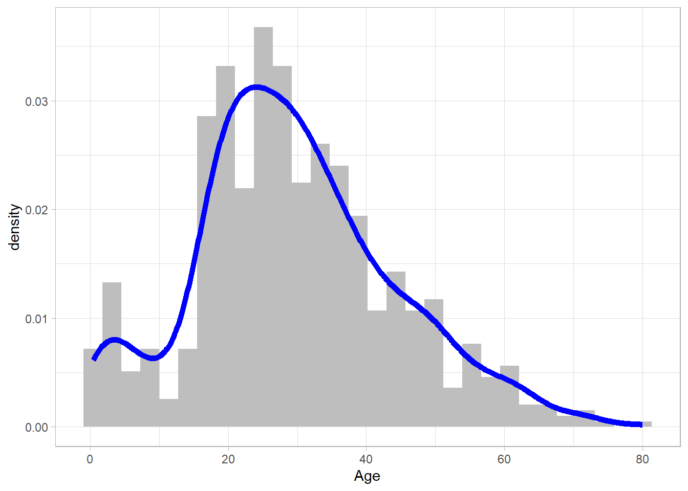
Bar plots
Bar plots are an excellent choice for visualizing categorical data. To create a bar plot, we use the geom_bar() function. As with histograms and density plots, we need to include only one variable on the x-axis. Let’s plot the variable Survived:
titanic_subset %>%
  ggplot(aes(x = Survived)) +
  geom_bar() +
  theme_light()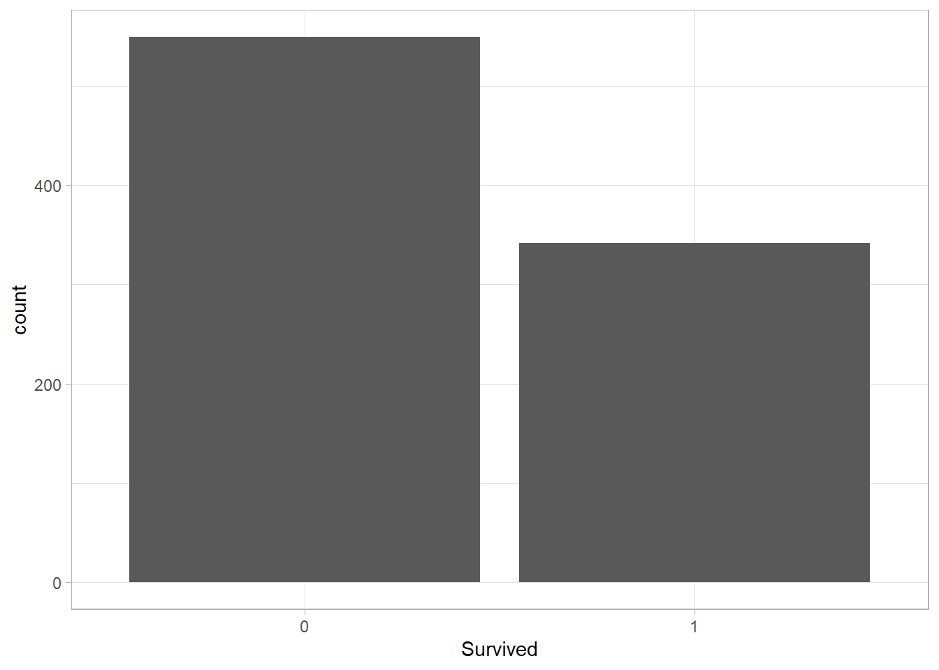
Similar to geom_histogram(), the y-axis here represents the number of observations. In fact, a bar plot can be thought of as a histogram for categorical variables, where each “bin” corresponds to a specific category. This plot shows that most passengers on the Titanic did not survive.
Instead of plotting counts on the y-axis, we may sometimes want to show a summary statistic. For instance, the average ticket price (Fare) within each category. In this case, the x-axis still displays the categories, but the y-axis will show a numerical value. To do this, we use the group_by() and summarize() functions from the dplyr package to transform the data before plotting. While this is not strictly part of ggplot2, it’s an important reminder that data often needs to be manipulated into the right shape before plotting.
Let’s first compute the average ticket price for each category of Survived:
# Average fare per category
average_fare <- titanic_subset %>%
  group_by(Survived) %>%
  summarize(Average_Fare = mean(Fare))

# Printing average_fare
average_fare
# A tibble: 2 × 2
Survived Average_Fare
<fct> <dbl>
1 0 22.1
2 1 48.4Now that we have a summary table, we can fill in both x and y inside aes(), just like we would for a scatter plot with two numeric variables. However, geom_bar() won’t work when we explicitly supply a y variable and so we use the function geom_col() instead:
average_fare %>%
  ggplot(aes(x = Survived, y = Average_Fare)) +
  geom_col() +
  theme_light()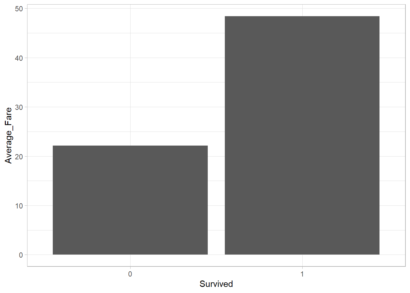
The average ticket price among survivors was higher than among non-survivors. This is an interesting insight as it may suggest that passengers who paid more had a higher priority when boarding the life boats or were located in more favorable areas of the ship (closer to the life boats perhaps?) before it sank.
Box plots
To visualize the distribution of a numeric variable, we previously used histograms and density plots. Another way to do this is with a box plot. As the name suggests, a box plot is essentially a… plot that includes a box, which represents the values close to the center of the distribution.
A box plot typically displays five summary statistics known as the five-number summary (those were also discussed in Chapter Statistical Distributions). These include:
Minimum: The smallest value
First Quartile (Q1): The 25th percentile, marking the lower edge of the box
Median (Q2): The 50th percentile, shown by the line inside the box
Third Quartile (Q3): The 75th percentile, marking the upper edge of the box
Maximum: The largest value
Let’s create a box plot for the Age variable using geom_boxplot():
titanic_subset %>%
  ggplot(aes(x = Age)) +
  geom_boxplot() +
theme_light() 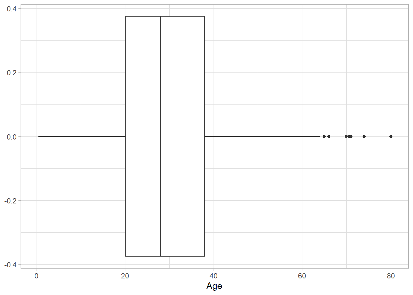
The black horizontal line represents the median. The box contains all values between the first and third quartiles, while the black dots outside the box are outliers. This plot shows that the Age variable is fairly symmetric, with just a few outliers on the right-hand side.
While histograms or density plots are preferred when visualizing the distribution of a single variable, box plots are excellent for comparing distributions across categories. To do this, we place the numeric variable on the y-axis and the categorical variable on the x-axis. For instance, the following plot shows the distribution of Age across survival categories:
titanic_subset %>%
  ggplot(aes(x = Survived, y = Age)) +
  geom_boxplot() +
theme_light() 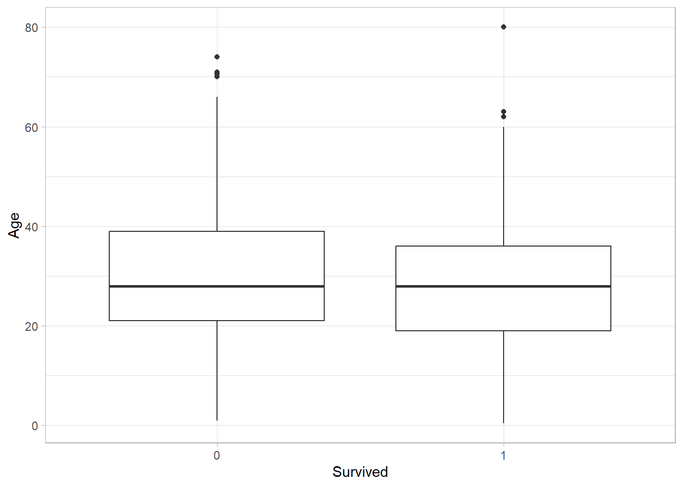
The centers of the two distributions are nearly at the same level, with the distribution of non-survivors being slightly higher. This might reflect the fact that older passengers were slightly less likely to survive the disaster.
Line Plots
Line plots are another useful type of plot, although we haven’t encountered them in previous chapters. As the name suggests, a line plot connects data points with a line, helping to visualize trends or changes over time or ordered values.
To see how this works, let’s manually create a simple dataset with just a few data points:
# Creating a simple data set
simple_data_set <- tibble(
  x = c(10, 8, 13, 9, 11, 14, 6, 4, 12),
  y = c(8.04, 6.95, 7.58, 8.81, 8.33, 9.96, 7.24, 4.26, 10.84))
Since we have two numeric variables, we can first create a scatter plot using the geom_point() function:
simple_data_set %>%
  ggplot(aes(x = x, y = y)) +
  geom_point() +
theme_light() 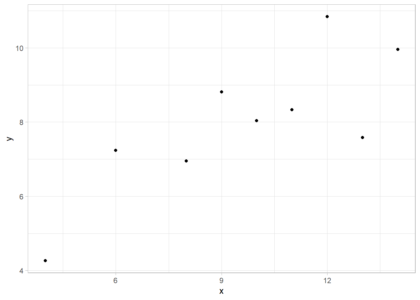
For a line plot, we use the geom_line() function instead of geom_point(). This connects the data points with a line:
simple_data_set %>%
  ggplot(aes(x = x, y = y)) +
  geom_line() +
theme_light() 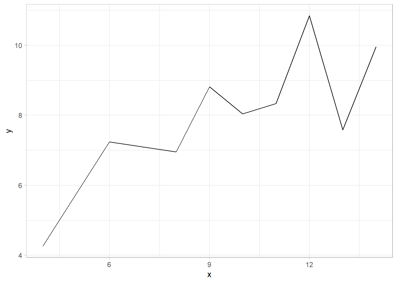
In the line plot above, the data points are not shown—only the line appears. To include both the individual points and the connecting line, we simply add the geom_point() function along with geom_line():
simple_data_set %>%
  ggplot(aes(x = x, y = y)) +
  geom_line() +
  geom_point() +
theme_light() 
This combined plot is often used to show both the trend (line) and the individual values (points), especially when the number of points is small and we want to see both clearly.
Facets
As we mentioned earlier, facets can be considered a separate, fifth plot element. Facets allow us to break down a plot into multiple subplots based on the values of at least one categorical variable. While we could always create separate plots manually for each category, facets provide a convenient way to generate multiple plots at once and display them side by side, making comparisons easier and more intuitive.
In ggplot2, there are two main functions for creating facets: facet_grid() and facet_wrap(). The key difference between them lies in how they organize the resulting plots.
facet_grid()arranges plots in a grid format. One categorical variable is mapped to the rows and another to the columns. This is ideal for visualizing interactions between two categorical variables.facet_wrap(), in contrast, uses a single categorical variable and wraps the plots into a series, typically laid out in multiple rows or columns. This is especially useful when there’s only one categorical variable involved.
To understand how these two functions work, let’s revisit the scatter plot we created earlier in the chapter. This time, we add facet_grid() to break the plot into two separate scatter plots—one for each category of the Survived variable:
titanic_subset %>%
  ggplot(aes(x = Age, y = Fare)) +
  geom_point() +
  theme_light() +
facet_grid(Survived ~ .) 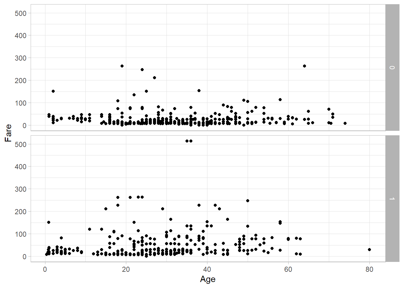
With both facet_grid() and facet_wrap(), we use the tilde (~) to define the layout of the plots. Since Survived appears on the left-hand side here, the plots are arranged in rows. If we want the plots arranged in columns, we simply place Survived on the right-hand side:
titanic_subset %>%
  ggplot(aes(x = Age, y = Fare)) +
  geom_point() +
  theme_light() +
facet_wrap(. ~ Survived) 
Using facet_wrap() instead yields a similar result when dealing with only one categorical variable:
titanic_subset %>%
  ggplot(aes(x = Age, y = Fare)) +
  geom_point() +
  theme_light() +
facet_grid(. ~ Survived) 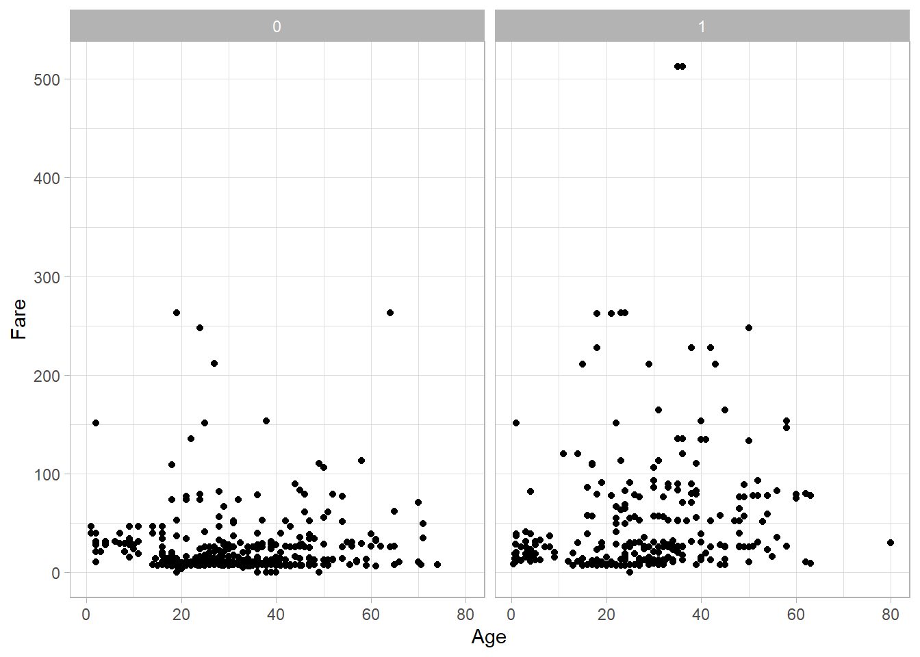
In this case, because Survived has only two levels, both functions produce nearly identical visual outputs.
To better understand the differences between these two functions, let’s now introduce a second categorical variable. We’ll create an Age_Category variable that classifies passengers as "Underage" (under 18), "Adult" (18 or older), or "Missing" (if the age is not available):
titanic_subset <- titanic_subset %>%
  mutate(
    Age_Category = case_when(
      is.na(Age) ~ "Missing",
      Age >= 18 ~ "Adult",
      TRUE ~ "Underage"))
Now, let’s use facet_grid() to create a grid of density plots for Fare, with Age_Category on the rows and Survived on the columns:
titanic_subset %>%
  ggplot(aes(x = Fare)) +
  geom_density() +
  theme_light() +
facet_grid(Age_Category ~ Survived) 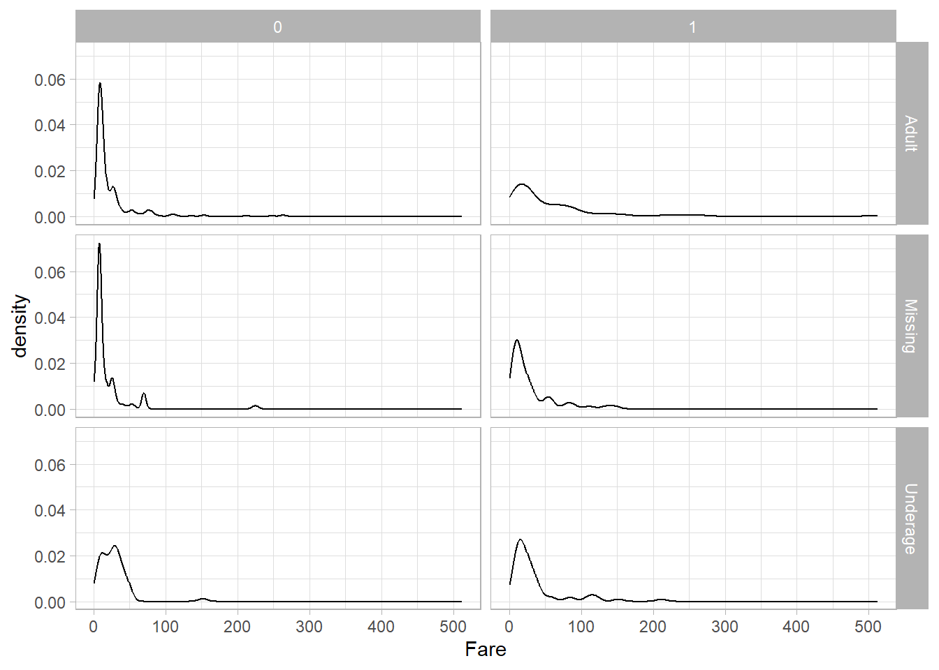
This results in six separate density plots. The rows represent the age categories, and the columns represent the survival categories.
If we use facet_wrap() instead, the layout changes:
titanic_subset %>%
  ggplot(aes(x = Fare)) +
  geom_density() +
  theme_light() +
facet_wrap(Age_Category ~ Survived) 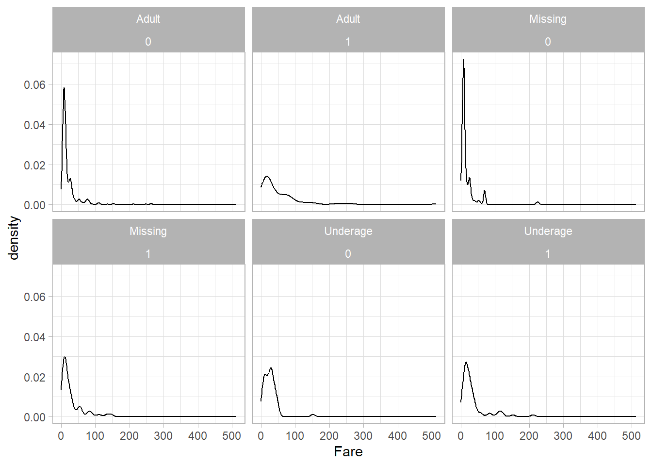
We still get the same six plots, but now each one is displayed as part of a flexible layout with a combined label like Age_Category = Underage, Survived = 1 at the top of each panel. This makes facet_wrap() especially useful when the combinations of variables don’t form a clean grid.
Theme
The ggplot2 package provides a default visual theme, as we’ve seen in all our plots so far. However, we can change this default theme by using one of the many alternatives included in the package, or even by customizing a theme to match our own preferences. In fact, we have already been using the theme_light() function in our previous graphs to apply a different look than the default one.
Playing with different themes is largely a matter of personal taste, but the built-in themes in ggplot2 are generally high quality and widely used. Choosing a theme helps ensure clarity and consistency in the way your plots are presented.
Because nearly every visual element in a plot can be customized, we’ll focus on the basic intuition behind theme customization.
Let’s say we want the tick labels on the x-axis to appear larger. If we’re using RStudio, we can type “axi” inside the theme() function to explore available options via autocomplete. Doing this reveals that the correct argument is axis.text.x.
This tells ggplot2 that we want to change the text labels on the x-axis. To specify how we want to change them, such as adjusting the size or color, we use the element_text() function. For example, here’s how we would increase the text size for the x-axis in our original scatter plot:
titanic_subset %>%
  ggplot(aes(x = Age, y = Fare)) +
  geom_point() +
  theme_light() +
  theme(axis.text.x = element_text(size = 15))
As a result, the x-axis labels now appear larger. We can clearly see this when comparing them with the unchanged y-axis labels. We can also modify other attributes, such as color. In the example below, the x-axis labels are now both larger and blue:
titanic_subset %>%
  ggplot(aes(x = Age, y = Fare)) +
  geom_point() +
  theme_light() +
  theme(axis.text.x = element_text(size = 15, color = "blue"))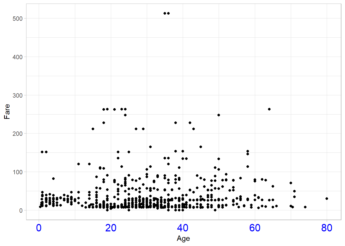
This example gives just a glimpse into the types of layout changes you can make using theme(). It’s highly recommended to experiment with these options and adjust your plots based on the needs of your audience or the context of your analysis.
Recap
In this chapter, we explored key types of plots in ggplot2, including bar plots, box plots, line plots, and the use of facets to create multiple subplots based on categorical variables. We also discussed how to customize the appearance of plots through themes and how to control aesthetics either globally within the ggplot() function or locally within individual geoms. These tools form the foundation for effective and flexible data visualization in R.